thimbl.

thimbl.

thimbl.

A project rebrand and user flow enhancement.

A project rebrand and user flow enhancement.

A project rebrand and user flow enhancement.

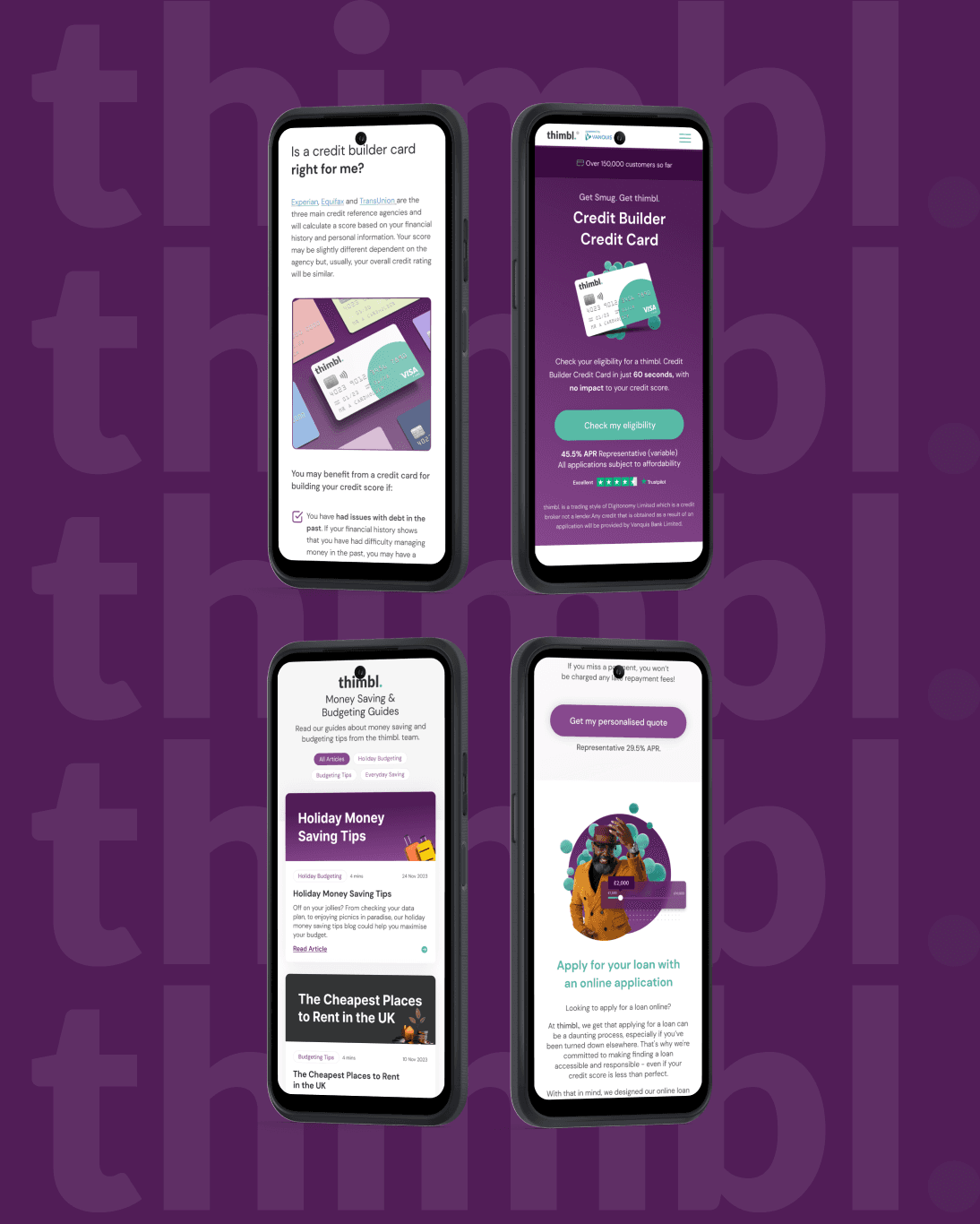
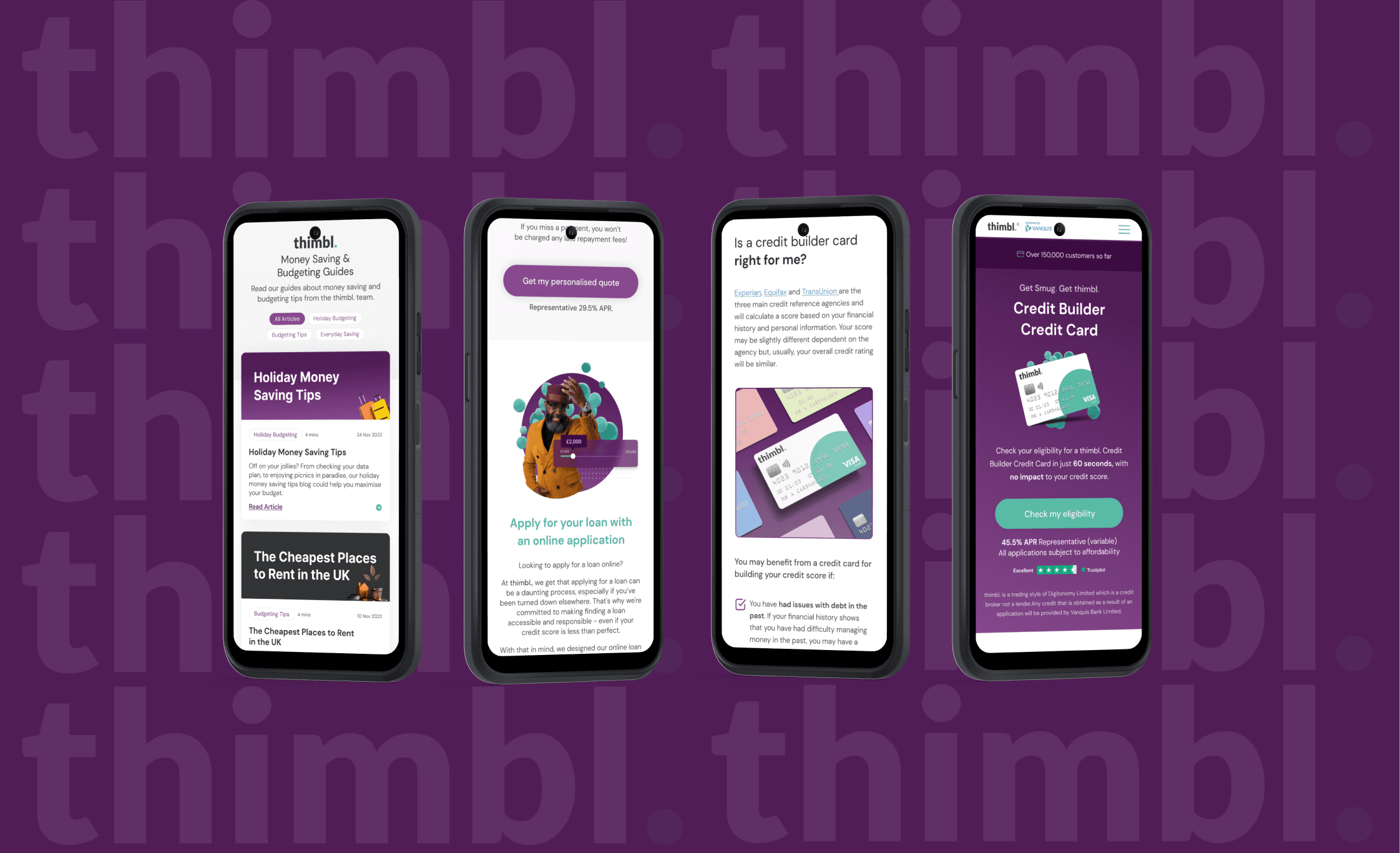
thimbl. began as a white-label credit card designed to help people with poor credit build their financial standing. Over time, we expanded the brand by introducing Balance Transfer and Purchase Offer credit cards, as well as a new loan product, broadening our offerings to meet a wider range of customer needs.

Skills Used

User Research, UX Design, UI Design, Interaction Design

Year Started

2021

Challenge

Challenge

To maximise conversions and position the thimbl brand to challenge market leaders, we needed a seamless journey that guided users from the landing page to completing their application. Understanding our users was essential, as was identifying the best way to showcase our unique selling points (USPs) and establishing trust through the right tone of voice.

The form had to be concise while still capturing essential data. Minimising drop-off rates and optimising the layout were crucial to boost completion rates. Additionally, a down-sell journey was introduced for users not eligible for a thimbl product, offering alternative's to retain as many customers as possible.

Solution

Solution

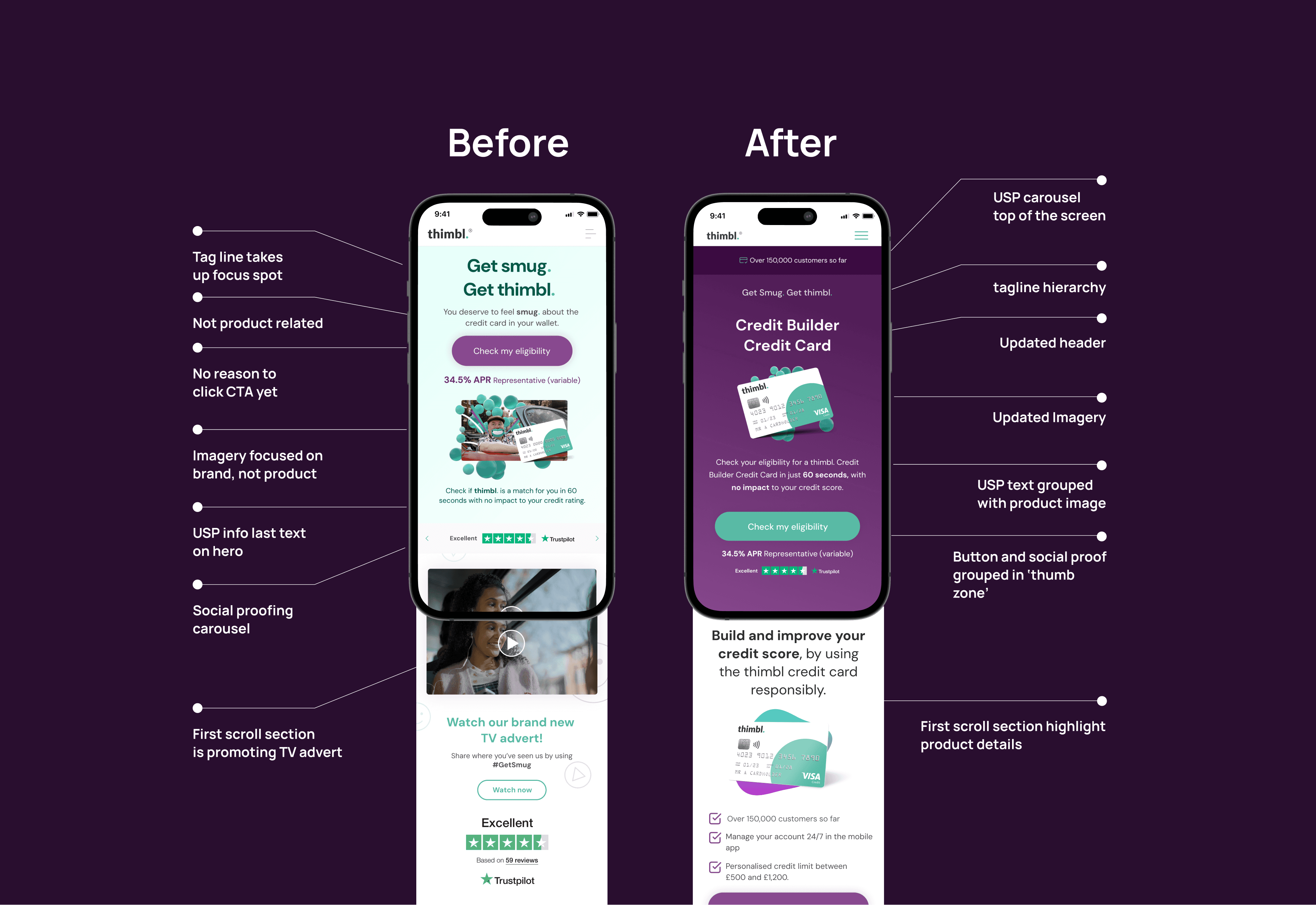
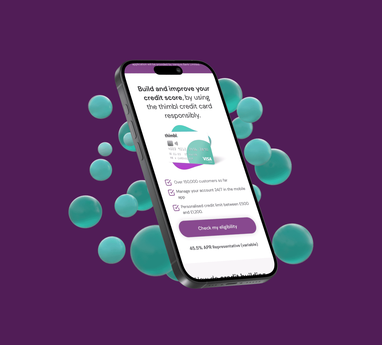
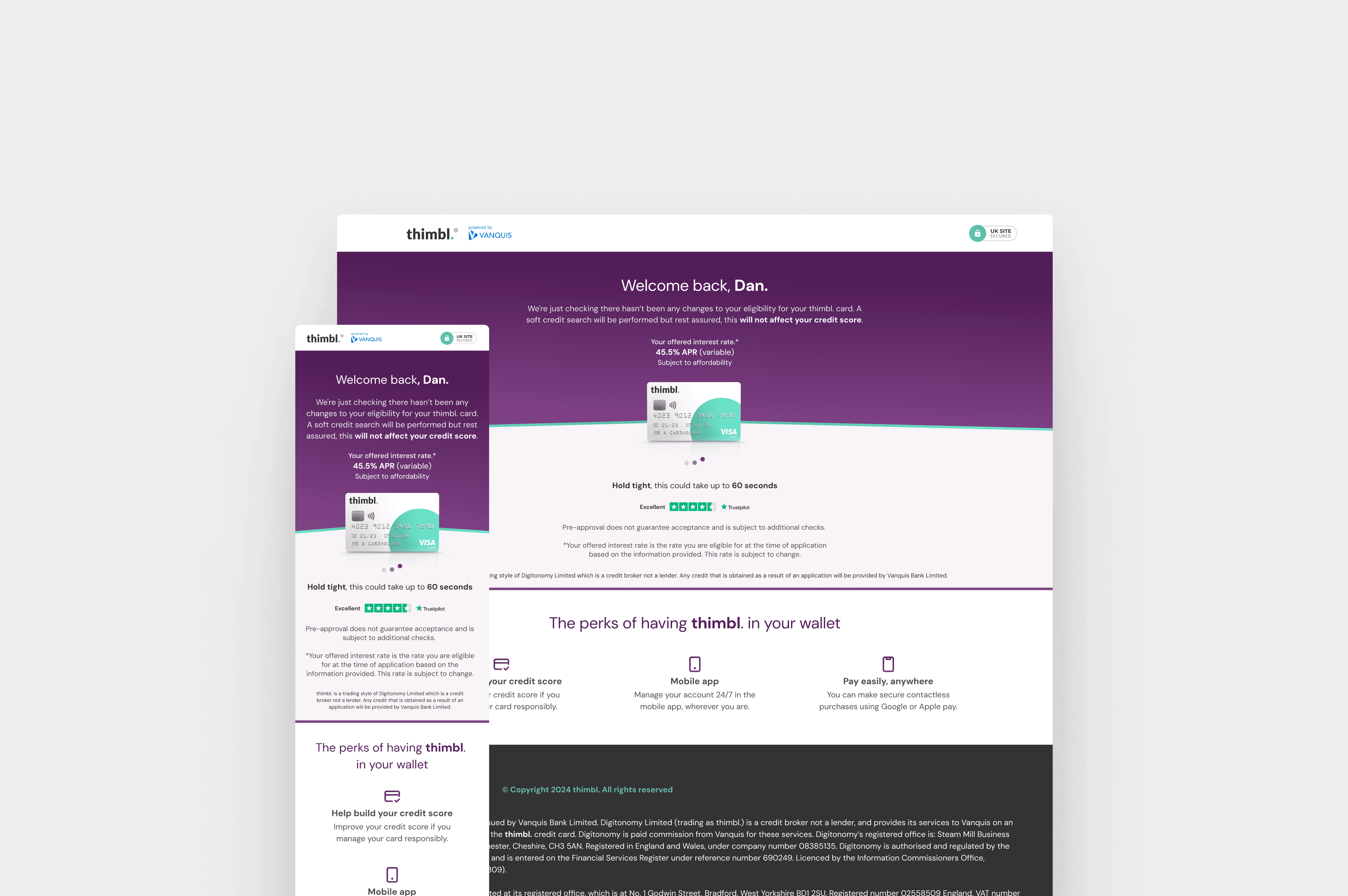
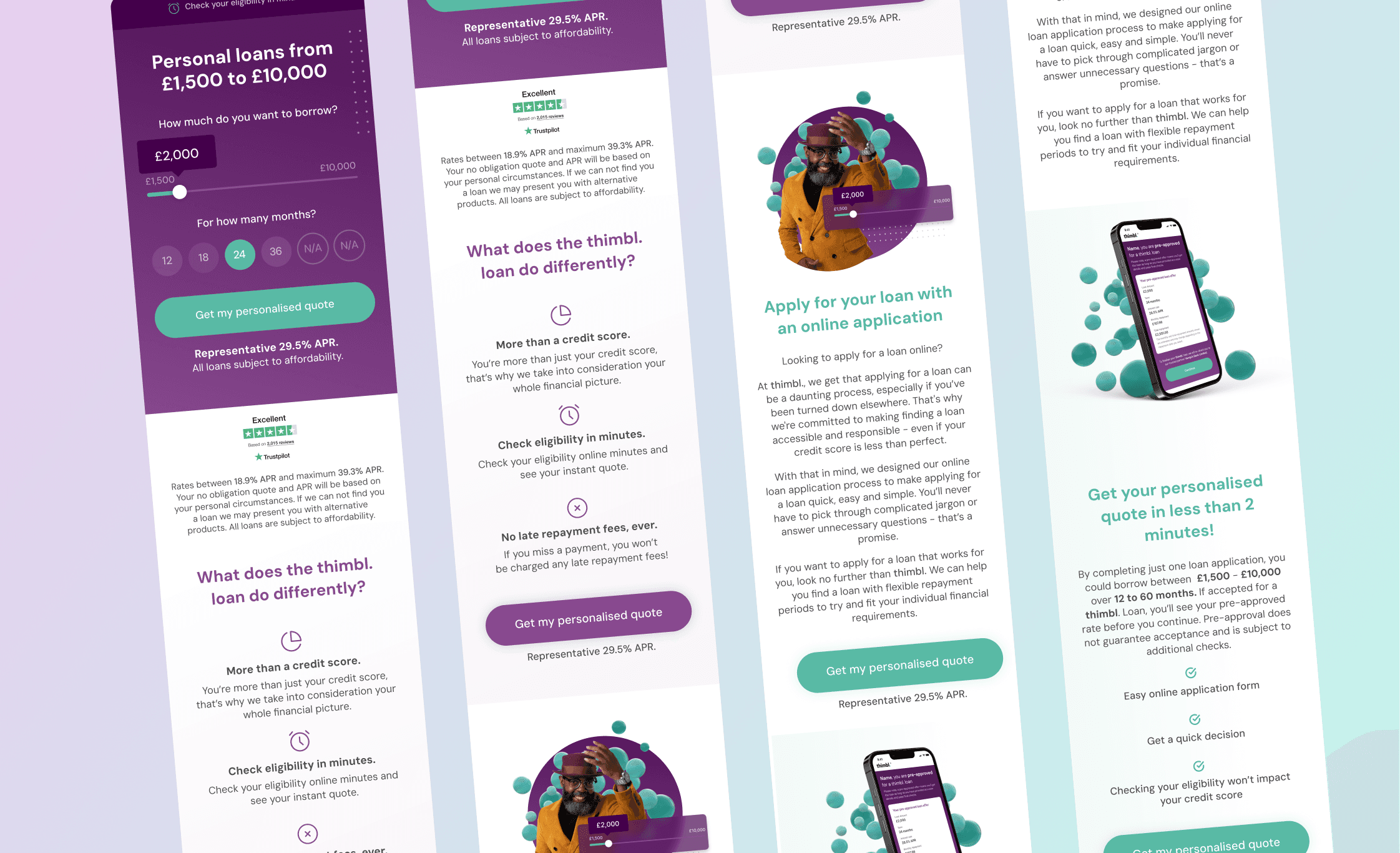
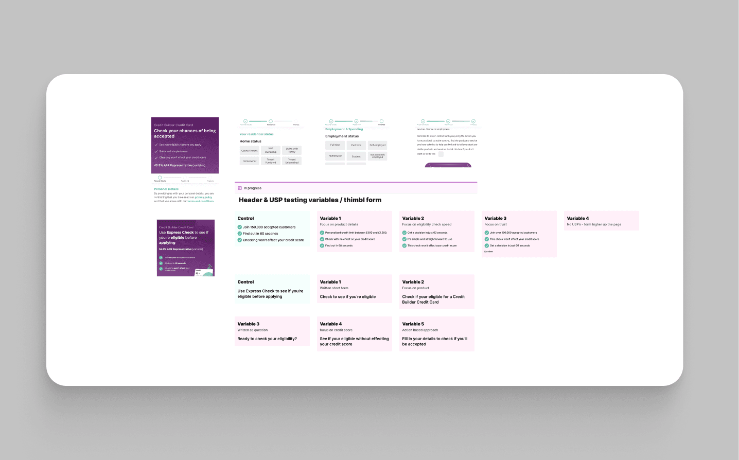
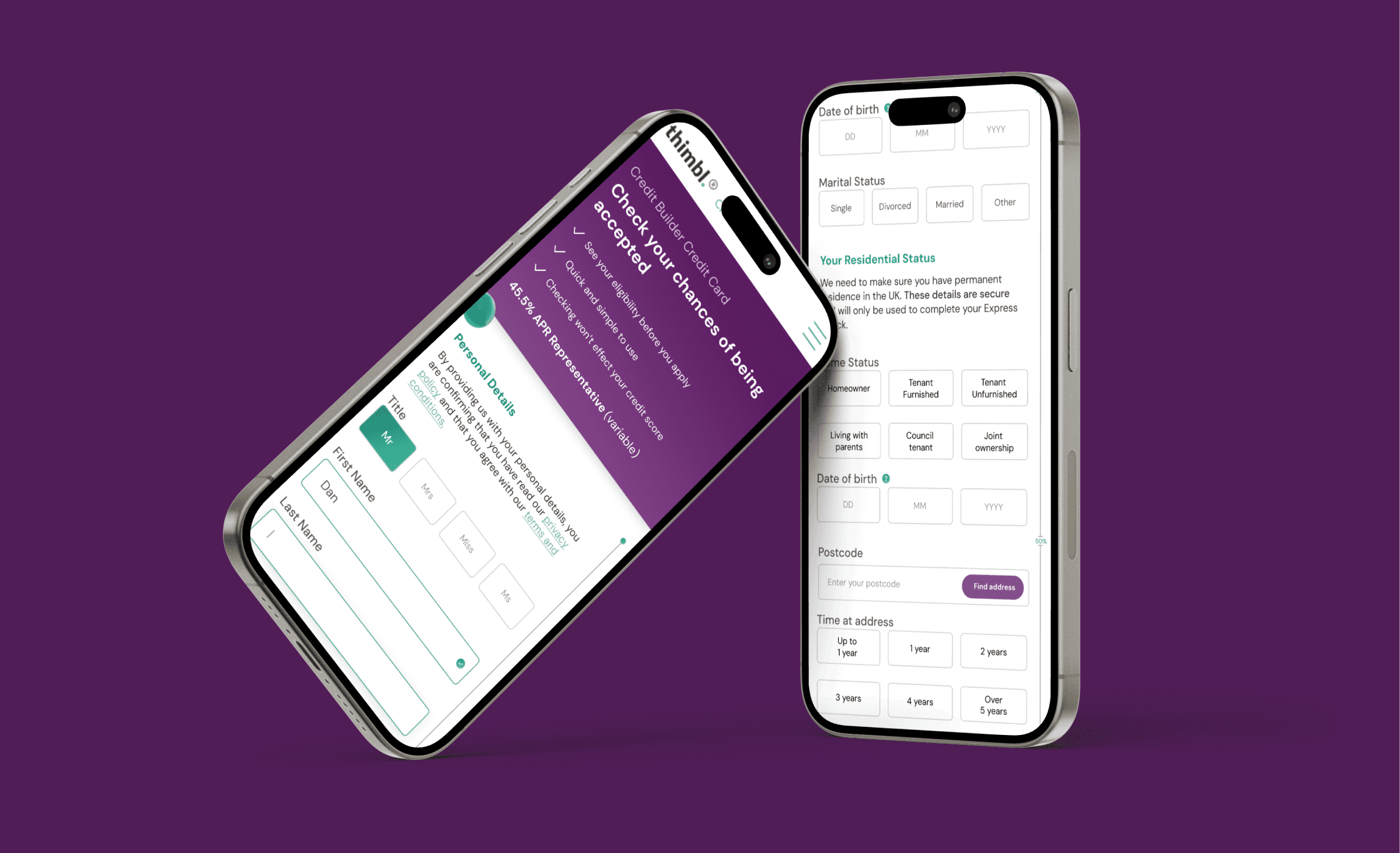
The rebrand of Thimbl focused on capturing a broader audience with updated visuals, messaging, and tone of voice to build trust and highlight USPs. The hero section was redesigned and A/B tested to increase engagement and drive applications. Form optimisation was achieved through continuous testing and restructuring, addressing pain points to improve completion rates. A down-sell journey was also introduced to retain users by offering alternative products for those ineligible for the credit card.

Snapshot Result

Snapshot Result

+ 28%

+ 28%

Click Through Rate

Click Through Rate

+ 16%

+ 16%

Converstion Rate

Converstion Rate

Project showcase laptop mockup

Result

The redesigned Thimbl website yielded significant improvements across key metrics. The form achieved a high conversion rate of 85%, from landing page visits to completed applications. We saw a notable increase in click-through rates, and our social media presence grew by 30%, driving more traffic to the site. Key design elements like the tabbed sections in the form and the progress bar enhanced user interaction, providing clarity on how much of the form was left to complete. These features minimised drop-off rates and improved the overall user experience. The down-sell journey was particularly effective, allowing us to retain users who were not eligible for the primary product by offering alternative solutions, keeping them within the company's ecosystem.

While the project was highly successful, we recognise there are still opportunities for iteration and further optimisation to enhance site performance and user engagement.

Thanks for visiting

Let’s talk projects, collaborations, or anything design!

Thanks for visiting

Let’s talk projects, collaborations, or anything design!

Let's connect!

Thanks for visiting

Let’s talk projects, collaborations, or anything design!

Dan Owen

2024